Thursday, October 31, 2013
Compare and Contrast
Candy Jar Drawing
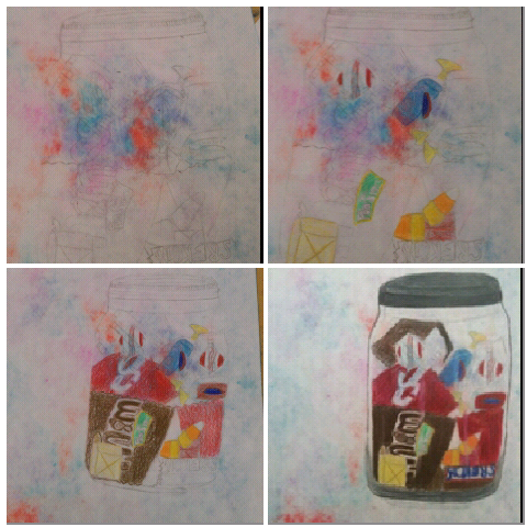
The second drawing that I was assigned to draw was a glass jar filled with candy. This drawing was very unlike the bike drawings we had previously finished. This drawing was a more laid back scenario. We could have a bit more fun with it at first. Unlike the first drawing where we focused mainly on value and composition, this drawing we focused on making the glass jar look like glass and shadowing. In this drawing we used colored pencils and layered colors over one another to create new colors, lighting and dimensions. This drawing, though it was more laid back than the bike drawings, I believe it was more difficult. Making the jar look like glass and adding shadows were very hard to do and a little nerve wrecking (as colored pencil doesn't erase as easily as normal pencils do). However, I still enjoyed the drawing and found that the challenge helped develop my skills. In this post the following pictures are included, the stages of my jar, the before and after adding of shadows, the origanol picture and finished product and lastly the final product on its own.
Tuesday, October 29, 2013
Bicycle Drawing
The first "real" art class assignment given to me was to draw this old, vintage style bike. Any angle, section, side or part of it. I just had to draw it. At first glance, the section of the bike that stuck out to me most was the chain and pedal. The chain and the pedal both had very miniscule details in them and looked very intricate close up. The angle that I decided to draw my bike at included both the chain and pedal, along with part of the tire and the kick stand. In the first days of drawing the bike, I had no idea where to start. So, I began with the alignment of things and where I wanted everything to go. This took a lot of time and I did a lot of readjusting as my drawing progressed. In all honesty, when we first learned value and composition, I didn't feel it was all that important. However, when I finally began to shade my drawing, I began to see the difference it made and how it helped my drawing look more realistic. As well as composition. Composition helped my drawing look more three dimensional and also not so boring. The materials we used in drawing the bikes were sketching pencils, a normal eraser as well as a kneaded eraser. The level of drawing in my opinion was a more intense level because of what we were drawing and the materials. However, I did enjoy drawing the bike very much. It was unique and fun. The pictures in this post are the stages of my drawing, a before and after of adding more value to my shading, the origanol picture and final product and the final product by itself.


